
XWeb Pros · Website Accessibility
Make Your Website Easier for More People to Use.
We help identify accessibility barriers and improve how visitors navigate, understand, and interact with your website through thoughtful design, development, and testing.
Illustrations use fictional sample content. Nothing on this page scans your website.
Five details in this sample
Select a detail to see where it appears. Highlights are optional and nothing moves on its own.
- Keyboard focus: A thick, two-tone outline on the active button shows keyboard users where they are.
- Readable text: Dark text on a light surface, and a dark button with white text, stay readable.
- Labeled fields: Each field keeps a visible label above it, so it is never only a placeholder.
- Video captions: Captions appear with the video, and a transcript sits underneath.
- Heading structure: One main heading, then section headings in order, gives the page an outline.
Accessibility in action
Small Design Decisions Can Make a Big Difference.
A site may have difficult-to-read text, unclear form labels or controls that cannot be used with a keyboard. We can review specific journeys before deciding whether targeted changes or a broader redesign makes sense.
Color Contrast
Foreground and background choices decide how much effort reading takes, especially in glare, on small screens, or with low vision.
Pale gray text on a light gray background and a faint button: many visitors cannot read the hours or find the action.
Keyboard
Try Navigating Without a Mouse.
Use Tab to move forward, Shift + Tab to move back, and Enter or Space where appropriate to activate controls.
Practice area, nothing is sent
Skip to demo contentOverview
Each control below can be reached and used with a keyboard, in the order it appears.
What is the focus order?
Skip link, menu links, this section, then the form fields and the button, following the page from top to bottom.
Guide only, not your actual focus
- Tab reaches the skip link, which jumps past the menu.
- Tab moves through the three menu links.
- Tab reaches the expandable section. Enter or Space opens it.
- Tab moves through Name, Email and the Submit demo button.
- Shift + Tab goes back. Tab past the end continues to the rest of the page.
Your real focus is shown by the thick dark outline with a yellow ring. The dashed blue guide box is only an explanation.
Forms
Help People Complete the Next Step.
Why it helps
Clear instructions and useful feedback help visitors understand what is needed and recover when something goes wrong.
- Labels stay visible while typing.
- Errors use words, not color alone.
- The summary links to each field.
- What you typed is kept after an error.
Alternatives
Make Important Information Available Beyond the Image.
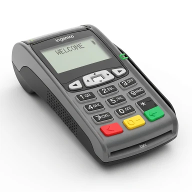
Alt text: “Gray countertop card terminal with a screen and keypad”
- Approach
- Describe what the photo shows and why it is there, briefly. No file names and no keyword lists.
- Purpose
- Someone who cannot see the photo still learns what kind of device the page is about.
Screen readers interpret page structure and accessible names and descriptions, not what an image looks like. How a page behaves should be tested with real assistive technology. The explanations above are not a screen-reader simulation.
Adaptable layouts
Content That Adapts to the Visitor.
Sample preview
Neighborhood Tutoring
Weeknight sessions
Small groups, Monday to Thursday, with time for questions.
Choose a sample session
Try a choice below. Nothing is sent or booked.
This is an illustration of adaptable design inside a contained box. The entire page also needs to work with browser zoom and the visitor’s own settings. Nothing here depends on hovering.
Process
A Practical Approach to Accessibility.
We identify key user paths, document barriers, agree priorities, make scoped changes and review the resulting experience. New content and third-party tools require ongoing attention. No legal compliance certification is implied.
Review: Examine representative pages, content, and important user journeys.
What an initial review is, and is not
A discovery conversation can lead to a barrier review, a prioritized remediation plan, and interaction and content checks. Broader work and maintenance are scoped separately. An initial review is not a comprehensive audit, a remediation project or ongoing monitoring, and no legal certification is provided.
- Issue
- On a sample contact form, the phone field uses placeholder text instead of a visible label.
- Effect on users
- Once someone starts typing, the hint vanishes. People who rely on memory, or whose screen reader does not announce placeholders consistently, may not know what the field wants.
- Proposed correction
- Add a persistent label with a format hint, and link error messages to the field.
Illustrative only. This is not a result for your website and there is no score.
Context
Understanding Accessibility and ADA-Related Concerns
Accessibility work identifies and addresses barriers. Legal obligations depend on the organization and its circumstances, and we do not give legal advice.
WCAG 2.2 Level AA is a widely used technical reference for web content. Following it is not the same as meeting a legal requirement, and we make no conformance claim.
An automated scan is not proof of full accessibility, and an accessibility widget or overlay does not fix underlying barriers. We do not guarantee compliance, certification or protection from legal claims.
Start here
Where Would You Like to Start?
Work may include an accessibility evaluation, improvements to content hierarchy, contrast, image alternatives, form feedback and keyboard interaction, followed by checks against the agreed scope. Automated checks alone are not a full assessment.
Choose an option to see how we would approach it.
Website Accessibility FAQs
Website Accessibility
Let’s Make Your Website More Usable.
We’ll help you explore practical next steps for your website and the people it serves. Tell us about any barriers you want to address.
Your inquiry
Share your name, email and phone. A website address and short description are optional.
We do not scan or audit the address. Please never share passwords or admin access here.
Name, email and phone are required. Company, website address and description are optional.
Phone: include your country or area code. Spaces, parentheses and dashes are fine.
Public website address only. It is never visited or scanned. Do not include passwords or access keys.
We help you find a practical next step for your business.
Built with precision. Delivered with pride.